

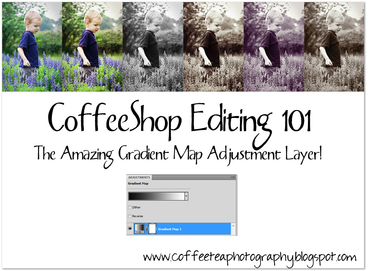
I think that many Photoshop CS and Photoshop Elements Users haven't yet discovered the amazing Gradient Map Adjustment Layer. All of the images above (other than the first SOOC) were enhanced using Gradient Map Adjustment Layers, ...
and this is only a tiny example of their power. I also want to share a little trick of how to change the colors of the Gradient Map Adjustment Layer on the "fly".
 Here is a simple image. I find it a bit cold so I want to warm it up.
 I added a gradient map adjustment layer. It is black to white because my foreground color was black and my background color was white (whenever you add one of these adjustment layers they will automatically be colored foreground to background). There is also a black to white preset if you click on the gradient map. This is a nifty fast way to turn a color image B&W.
  I put the black to white gradient adjustment layer into soft light blending mode. It adds a nice "pop" of contrast.
 Now for the fun part! Click on the gradient itself and a box will pop up. Then click on the left color stop (as seen in the image above with a red arrow) to open up your color picker.
  Now pick a color, any color. I decided on deep red. Press OK.
 Now click on the right color stop to open the color picker.
 This time I went with a soft yellow. These are just samples, you can use any color you want. Press OK.
 Now my image is much warmer. But perhaps I want a tinted black and white.
 I clicked on the background and then added a black to white gradient map adjustment layer (as seen above) to make the image black and white. However, this time I have the red to yellow gradient map above it so I have a tinted black and white with added contrast (because the red to yellow gradient map is in soft light blending mode). I can also put that layer in color and adjust the opacity. Or overlay blending mode. See, you just can't stop playing... :-)
 Why not click on the red to yellow gradient map and make it pink to cream and put it in color blending mode and lowered opacity? Now I have a pink tinted B&W.
 Or chocolate to cream in color blending mode and lowered opacity. Now I have a vanilla tinted B&W.
  Another enhancement I love to do is add a black to white gradient map adjustment layer and dial down the opacity to mute the colors. The blending mode is Normal. Then I make a copy of the background and put that in soft light and adjust the opacity to taste. Now I have a muted color "pop".
 Here is the before/after with the muted color "pop".
 I am only touching on gradient map adjustment layers, but now you hopefully are excited to experiment. Remember, if you put a gradient map adjustment layer in soft light or overlay blending mode you will see a contrast boost with a touch of color. If you just want a color tint without the contrast boost, then put the blending mode into color and adjust the opacity. Gradient Map Adjustment layers also come with built-in layer masks, so you can selectively mask out the effect if you want.
EXTRA NOTES! I am a big fan of Geoff, who helps admin my CoffeeShop Flickr Group and is an expert in PSE. He posted this great info over on Flickr and I thought it would be a great idea to share it with you!
"Very nice tutorial - another thing I've learned is that once the gradients are made you can just save them all in a stack of layers in an otherwise blank PSD file. Use a standard image with a full range of tones so that you test them as you go, but when you're happy with them you can remove the image background layer before saving. You can then just open that PSD file at any time and drag a gradient layer across to the image you want to try it on. You can then edit the gradients further if you like.
Here are a few of my "ready-use" gradients.....
1. Blue to Copper..... 3c4f5a to e6cfaa
2. Blues..... 0f1a29 to a9c6c6
3. Neutral Highlights.... 45392b to ffffff
4. Antique Fade..... 28270f to e4e2c7
5. Purple-Lilac..... 201e1d to f0eafb
You can also introduce intermediate colours of your own choice (making tripletones or more) and you can also move the middle slider of the gradient control so that the gradient is lighter or darker. Just make the gradients, stack them in your PSD file and drag them across when you want to try something different. If you don't like one, just drag another over."
I hope you enjoy using Gradient Map Adjustment layers as much as I do! If you haven't already, check out all of my photo-editing tutorials.
Post any questions over at my CoffeeShop Flickr Group!


