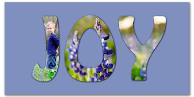
I have had a few readers ask me to write a tutorial on making storyboards with text cut-outs in Photoshop and Photoshop Elements... You see these around all over and they are super easy to make on your own. It is especially fun to make ones with your kid's names, favorite words, or even numbers or symbols. Click on the images to see larger versions.
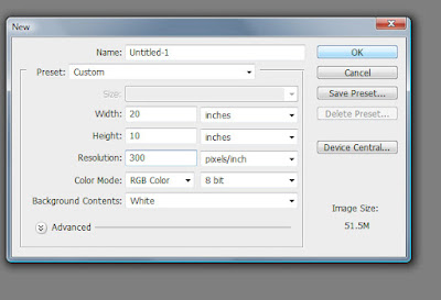
Start by making a new template. If you plan on printing it, make it 300px/inch. If you want to put it on the web you can use 72px/inch. This one will be 20x10 inches and can be printed.
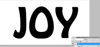
Pick a font, any font and type in your text! Try to choose a font that is bold so you can see more of your image. This one is HOBO Std.
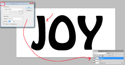
Make a new layer on top and click on it to select it. Use your magic wand tool to select the first letter ("J" in this case). Make sure "contiguous" and "select all layers" is checked on your top menubar. Then Edit, Fill with black. Now you will have a "J" on the top layer.
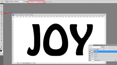
Continue on this way, making a new layer and selecting it, then using the magic want to select the next letter and Edit, Fill with black. In this case I will have three layers, "Y", "O", and "J" (starting from the top). Drag your text layer (just over the background) into the trash. You don't need it anymore.
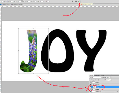
Click on the first letter, "J", to select that layer. Then open your first image, click "V" to get your move tool, then click on the image and drag and drop it on your storyboard.
Go to your fly-out menu on your layer's pane (make sure your image layer is selected and it is just above the black clipping mask) and select "Create Clipping Mask" (Photoshop only) or just select the image and press Alt+Ctrl+G (Photoshop only) OR dangle your mouse between your image and clipping mask cutout while pressing Alt, and when you see the hand become another little B&W round symbol, click. In Photoshop Elements click on the image layer and press Ctrl-G or dangle your mouse while holding Alt and look for the little symbol as mentioned above.
Once your first image is grouped with the "J", then Ctrl-T (free transform) and hold Shift in Photoshop or make sure "Constrain Proportions" is checked in Photoshop Elements and transform and move the image to fit your cut-out "J". If you can't see the bars to drag and adjust, click Ctrl-0 (that is zero) and it will shrink to fit in your screen.
Click the top check-mark on top when your image is placed to taste. You can make further adjustments later if you want.
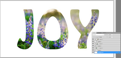
Continue to add your images and group them with the proper letter.
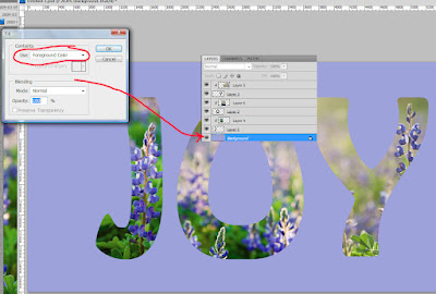
If you want to change the background color, simply click to select the background and Edit, Fill with the color of your choice.
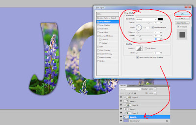
If you want to add a cool drop-shadow effect, click on the first letter layer (not the image you grouped with the letter, but the actual "J" layer. Then Layer, Layer Style, Drop Shadow and adjust to taste.
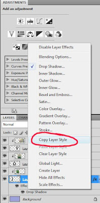
Click on the fly-down menu and select "Copy Layer Style".
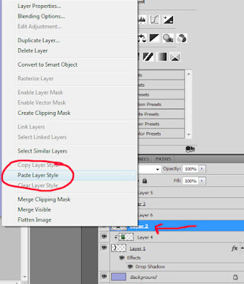
Click on your other letter layers (in my case the "O" and "Y") and then use the fly-out menu to "Paste Layer Style" to each letter. Make sure you click on the layer name, not the actual thumbnail!
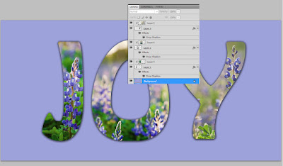
You are now finished! Wasn't that easy? Now go make some fun text templates!!!
If you want to download this template to practice, just click HERE!
If you have any questions, please post them them in my CoffeeShop Flickr Group!


